Bridging Hardware and Software in Genomic Design
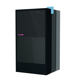
PacBio builds DNA sequencing machines that scientists and labs around the world use to read genetic code. They were launching a new version of their sequencer that had a touchscreen built in. I was brought in to lead the SMRT Link redesign (the software redesign): set the UX direction, design key parts of the experience, and manage a team of three junior designers.
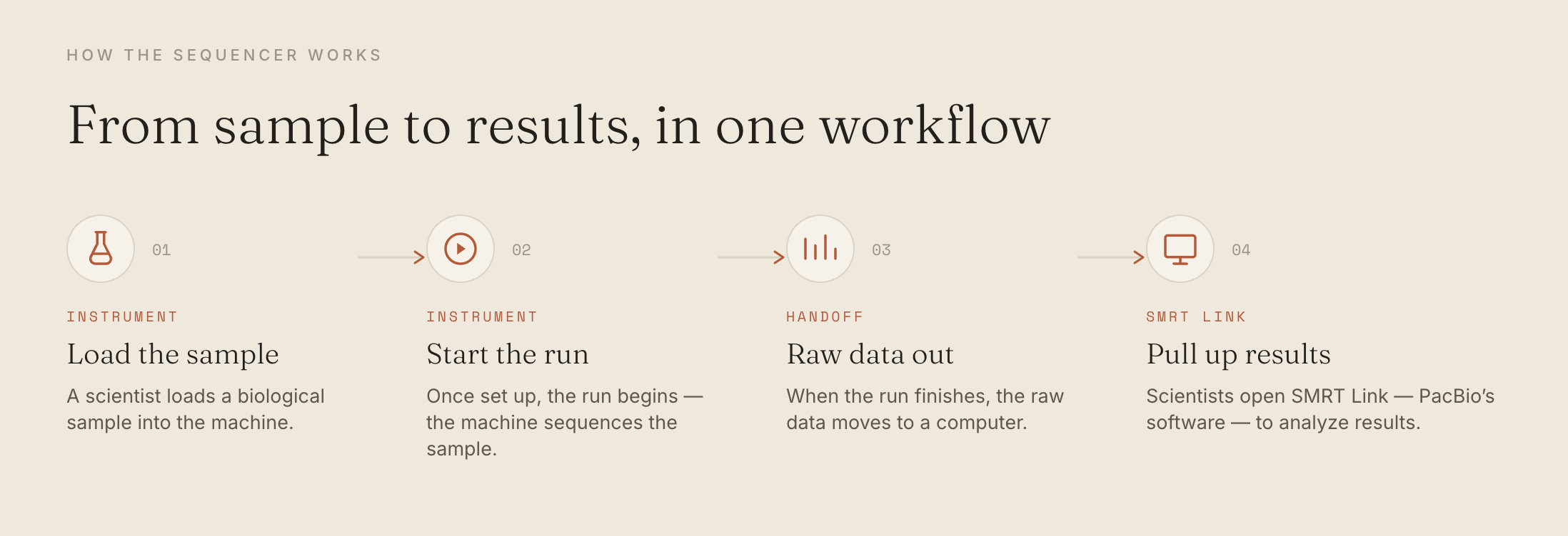
https://www.pacb.com/revio/Here's a quick rundown of how the the new sequencer works:
Right away, two things made it challenging. SMRT Link was about ten years old and really looked like it, it also hadn't caught up with features that the new machine could do. Second, the touchscreen had already been designed by a different outside firm before I even joined. So I was stuck in the middle: an outdated software on one side and inheriting design decisions I didn't make on the other side.
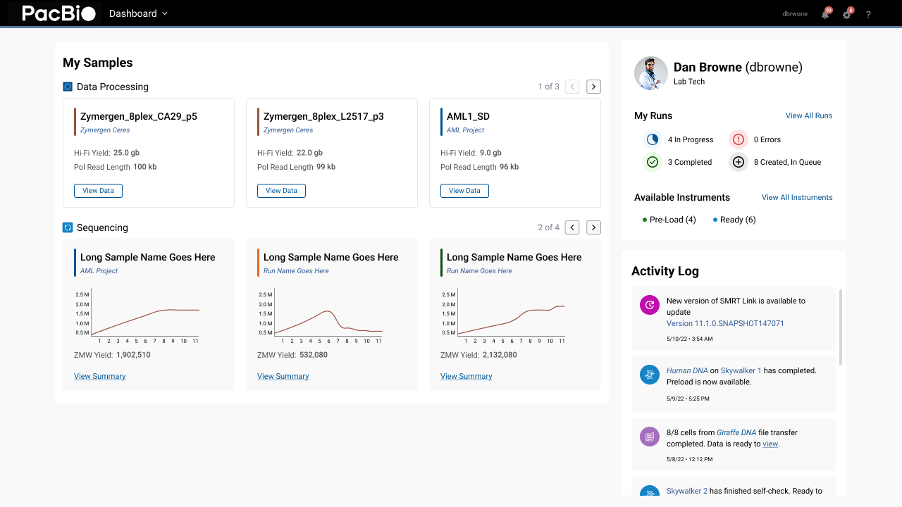
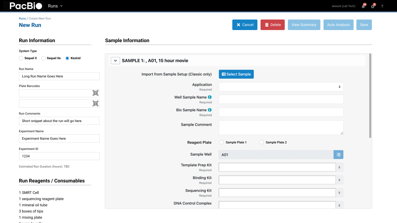
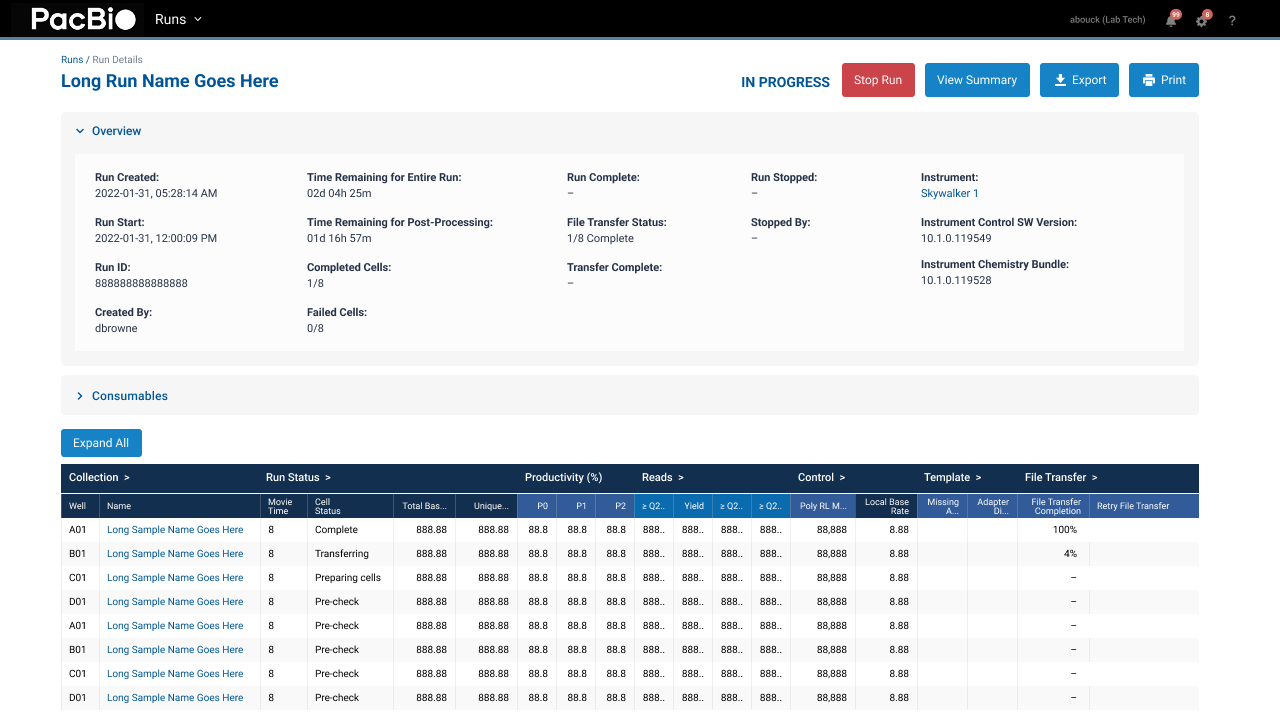
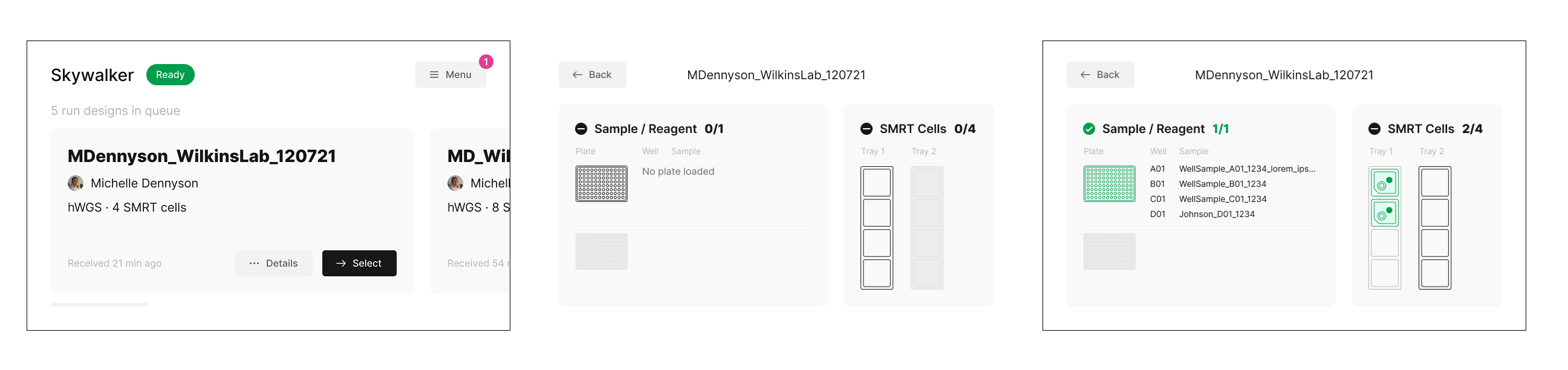
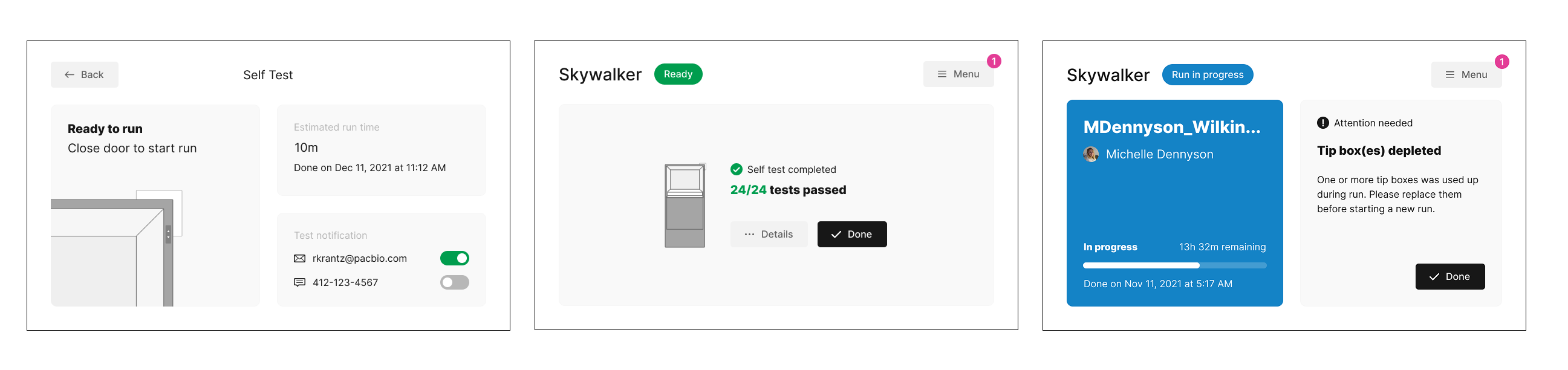
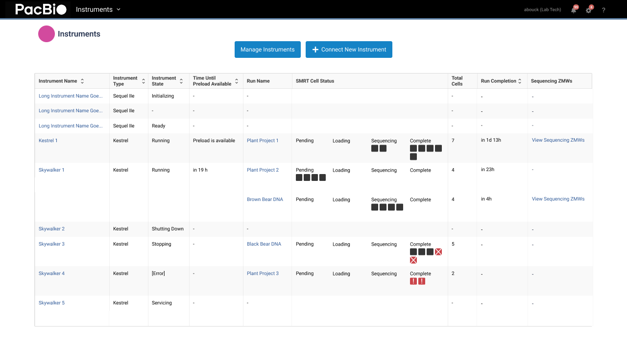
As you can see here, the visual styles don’t match at all. The left side shows the touchscreen UIs designed by the outside from and here on the right you can see what needed to be redesigned.
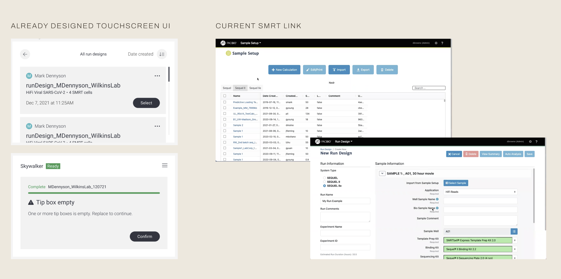
The challenge
The real question became: how do you make a touchscreen you didn't design and software you can't fully rebuild feel like a single, unified experience?
How might we make 2 products feel like one unified system?
Since I had junior designers running research alongside me, I set two goals for us to follow.
- First, really understand how people used this machine on a day-to-day basis, not just the moments they tapped a screen.
- Second, get a full picture of SMRT Link, the existing software, to see what worked, what didn't, and what we were technically allowed to change.
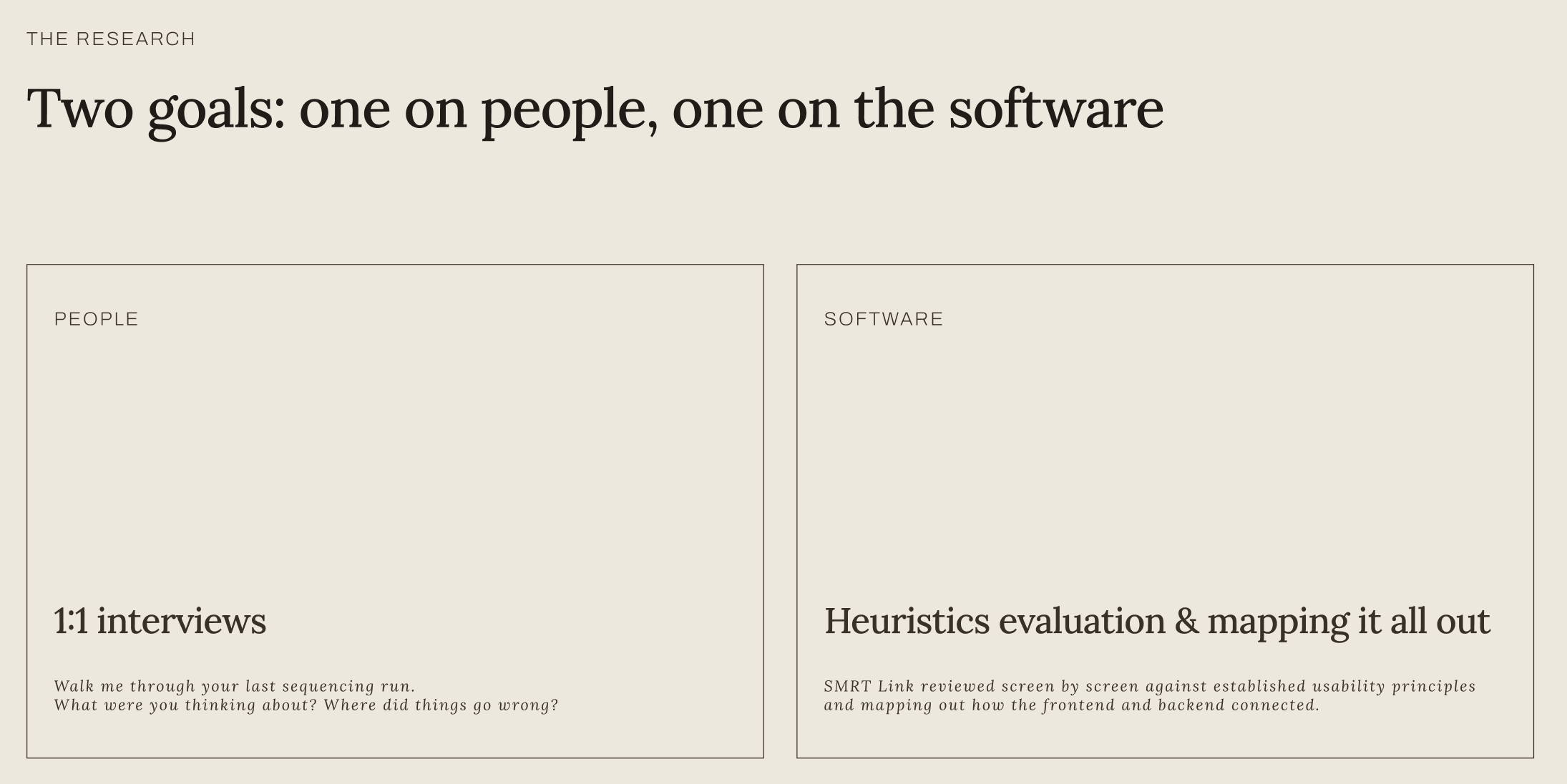
I interviewed scientists and lab operators about their actual day: walk me through the last sequencing run you did, what were you thinking about, where did things go wrong. One thing kept surprising me, nobody described the machine and the software as separate things. To them it was one task: run the sequencing on the machine then check the results.
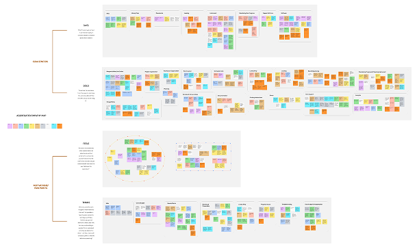
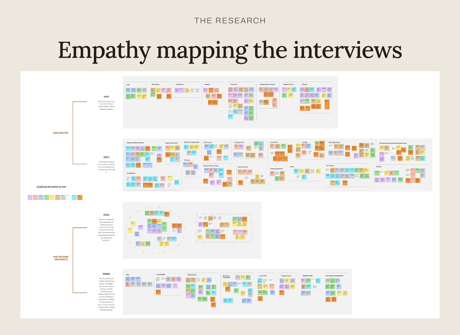
I mapped all of this into an empathy map, and that's when the real problem became obvious: the sequencer's touchscreen and SMRT Link shared nothing in common. The two pieces used completely different terminology and visual styles. It felt like two disjointed pieces.
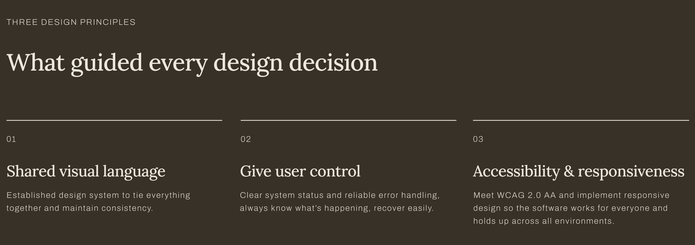
And that led me to our first design principle: build a shared visual language so the whole thing feels like one ecosystem.
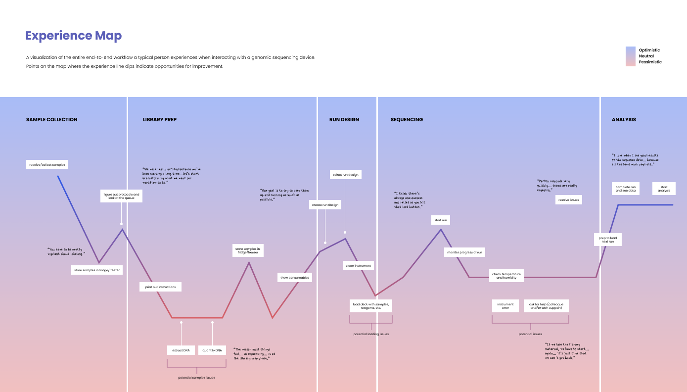
With the insights I gained from the empathy map, I assumed that a a lot of friction would be from the UI: confusing flows, bad labels, that kind of thing. But when I built out the full experience map, start to finish, the data told me something different.
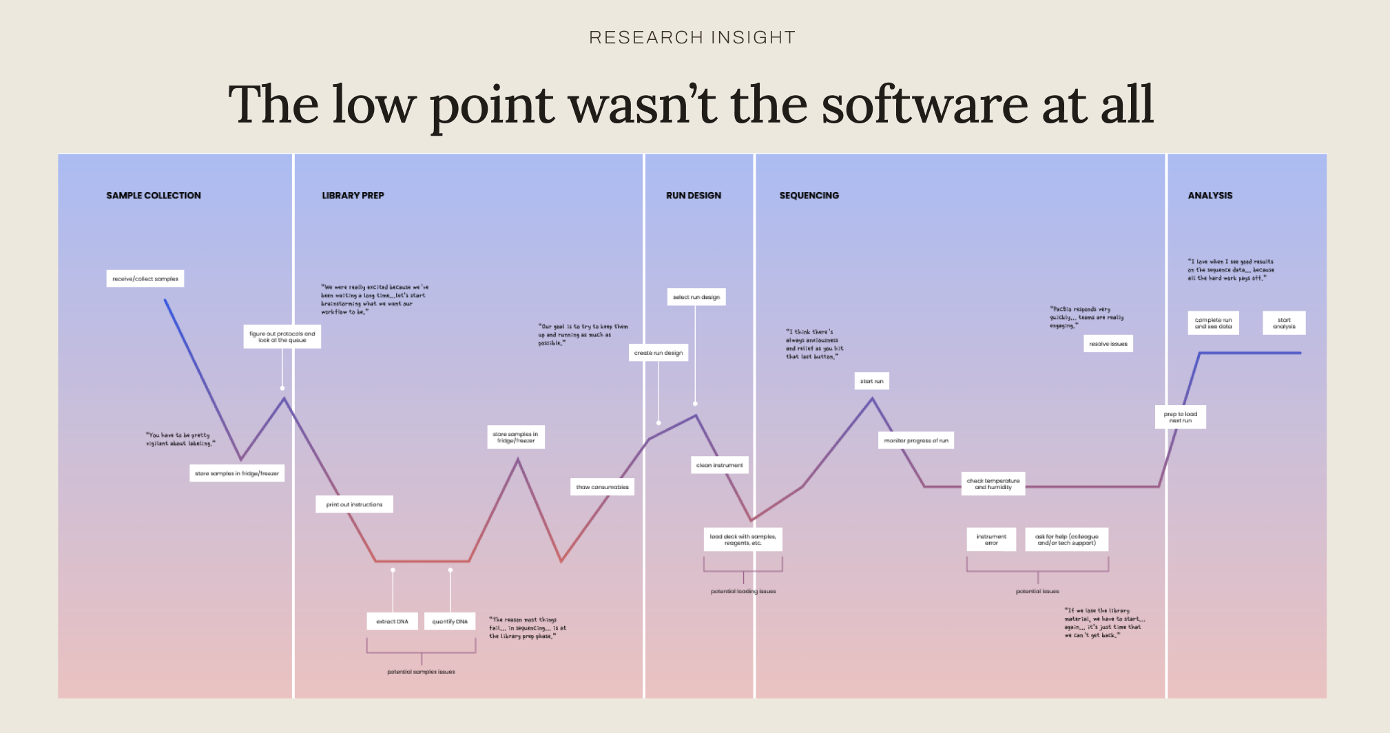
People were anxious about losing their sample, not about a confusing button. By the time they reached the software, they were relieved. That completely changed my working theory… I walked in assuming that the biggest pain point was going to be interface friction, and the research told me it was an emotional one, not a usability one.
That framed our second design principle: give users control, provide immediate feedback, clear status, solid error handling, not because the software was confusing, but because people arrived already anxious and needed the software to address that.
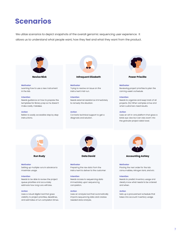
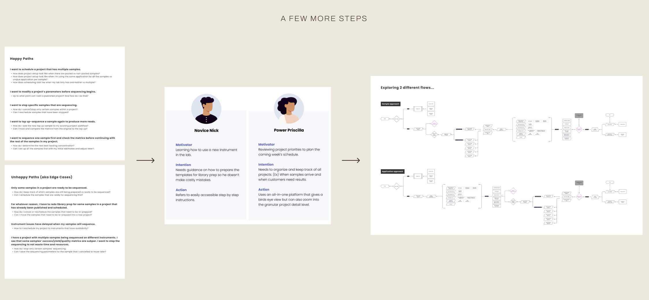
Before we sketched a single screen, we took those principles through a few more layers. We mapped out the jobs people actually needed to get done, both the happy paths and the unhappy paths. From there we built out personas like Novice Nick, who’s a beginning and needs step by step guidance. Then there’s someone like Power Priscilla, who already knows what she's doing and just wants a birds eye view she can zoom into the data.
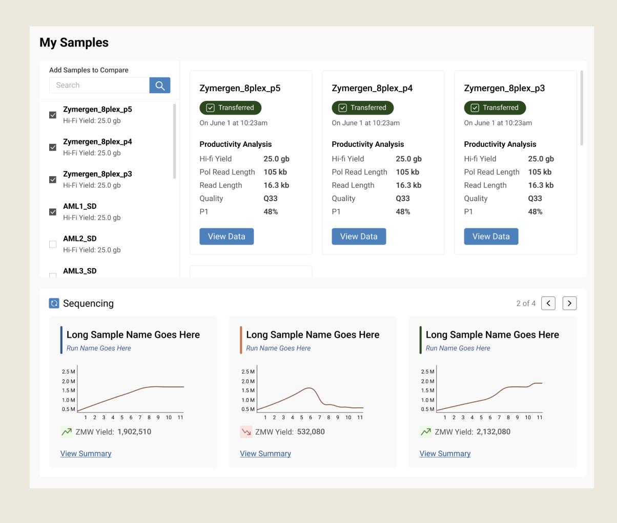
That "birds eye view" Priscilla wanted turned out to be a bigger thread than just one scenario. It kept surfacing across research: scientists didn't just want raw numbers, they wanted to see yield, read length, all these highly technical data points.
This shaped the data visualization work directly. Instead of static tables of stats, we designed comparison views across samples (side-by-side cards showing the data they cared about) and trend charts scientists could scan in seconds rather than parse. It's also where the "immediate feedback" principle showed up most directly: a scientist could look at a yield curve and know in seconds whether a run was fine, without digging through logs or tables: the anxiety-to-relief arc we'd mapped in research, made visible in the interface itself.
And on top of everything, I also ran a full heuristic evaluation of SMRT Link. I walked through every screen against standard usability principles. I found that there really was no consistent design system, so something as basic as exporting a file worked differently depending on which part of the software you were in. Labels were confusing, for example, a button called "Lock" actually just meant "save," which confused people constantly. The software gave almost no feedback when you clicked anything, and error messages would show up at the bottom of a screen. It also didn't meet minimum accessibility standards.
The North Star
I handed these three principles to the team and had them start mocking up concepts, while I focused on the system level strategy, the bigger picture of making sure the software actually felt like it belonged to the same family as the touchscreen.
Insight to Opportunity
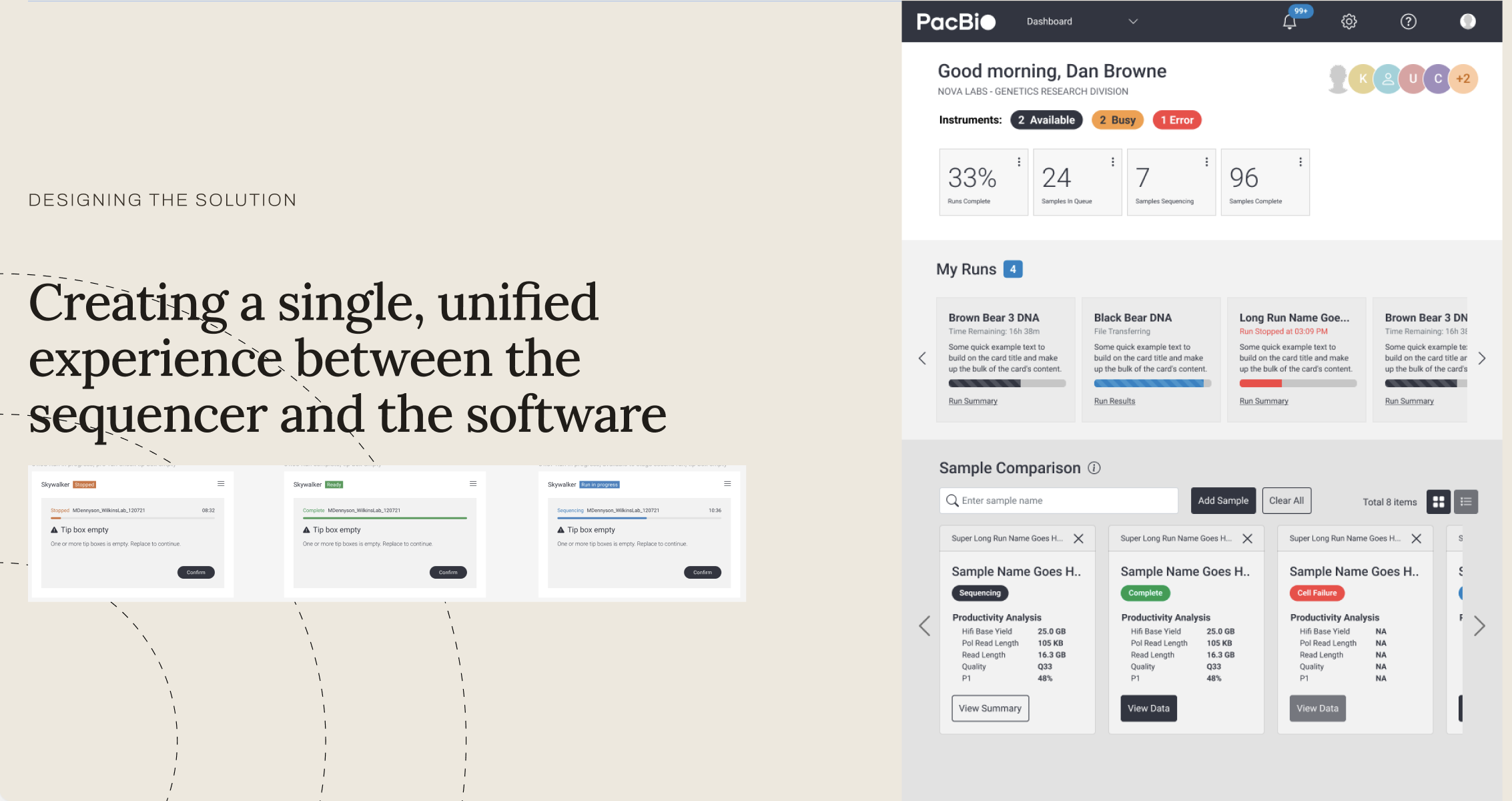
From Complexity to Clarity
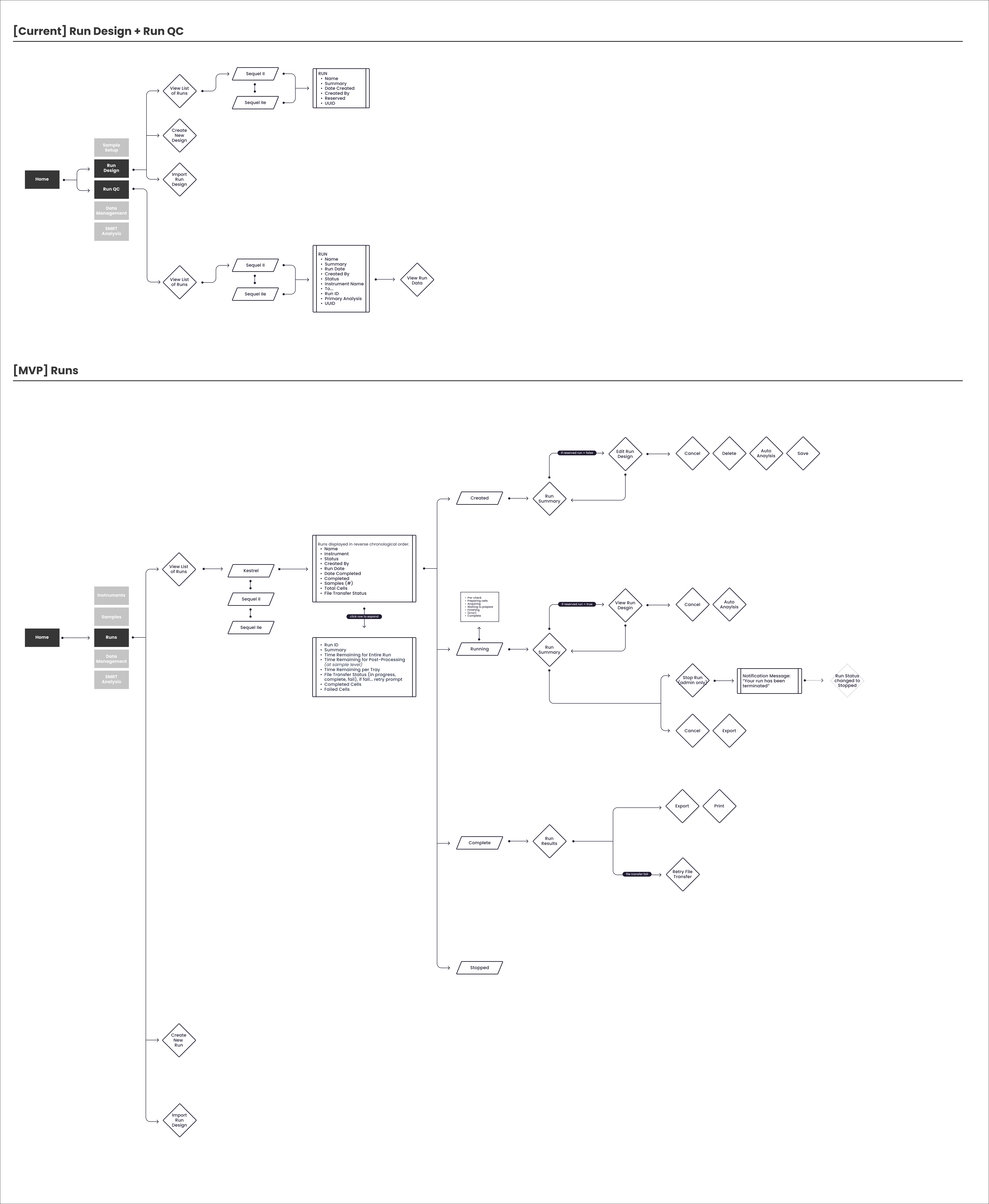
Mapping the end-to-end user flow allowed us to stress-test the architecture against real-world lab scenarios. By eliminating friction points in the legacy experience, the proposed solution significantly reduces cognitive load—transforming a complex setup into a more intuitive, high-velocity path to results.
Impact
The new design framework bridged the gap between the instrument and software experiences, giving users a sense of continuity and trust. Scientists no longer switched context — they simply continued their work. The result was a cohesive product ecosystem that shortened setup time, improved error detection, and elevated PacBio’s brand as a leader in human-centered genomics technology.